Case studiesarOS 2.0
Conversations that convert
arOS is an AI marketing platform for small businesses and agencies, with 32K+ registered users. I redesigned it around a single chat grounded in each customer's business context, and owned the work end to end: discovery, research, wireframes, prototypes, high-fidelity UI, and the PRD.
- Adoption
- 1,400+ users on 2.0, with 400 active a week and 180 a day in its first 3 months
- The shift
- From separate AI agents to one chat with context and memory
- Key result
- Business context in almost 70% of conversations, up from about 40%
- Research
- 9 interviews, 11 usability tests, and 550+ session recordings
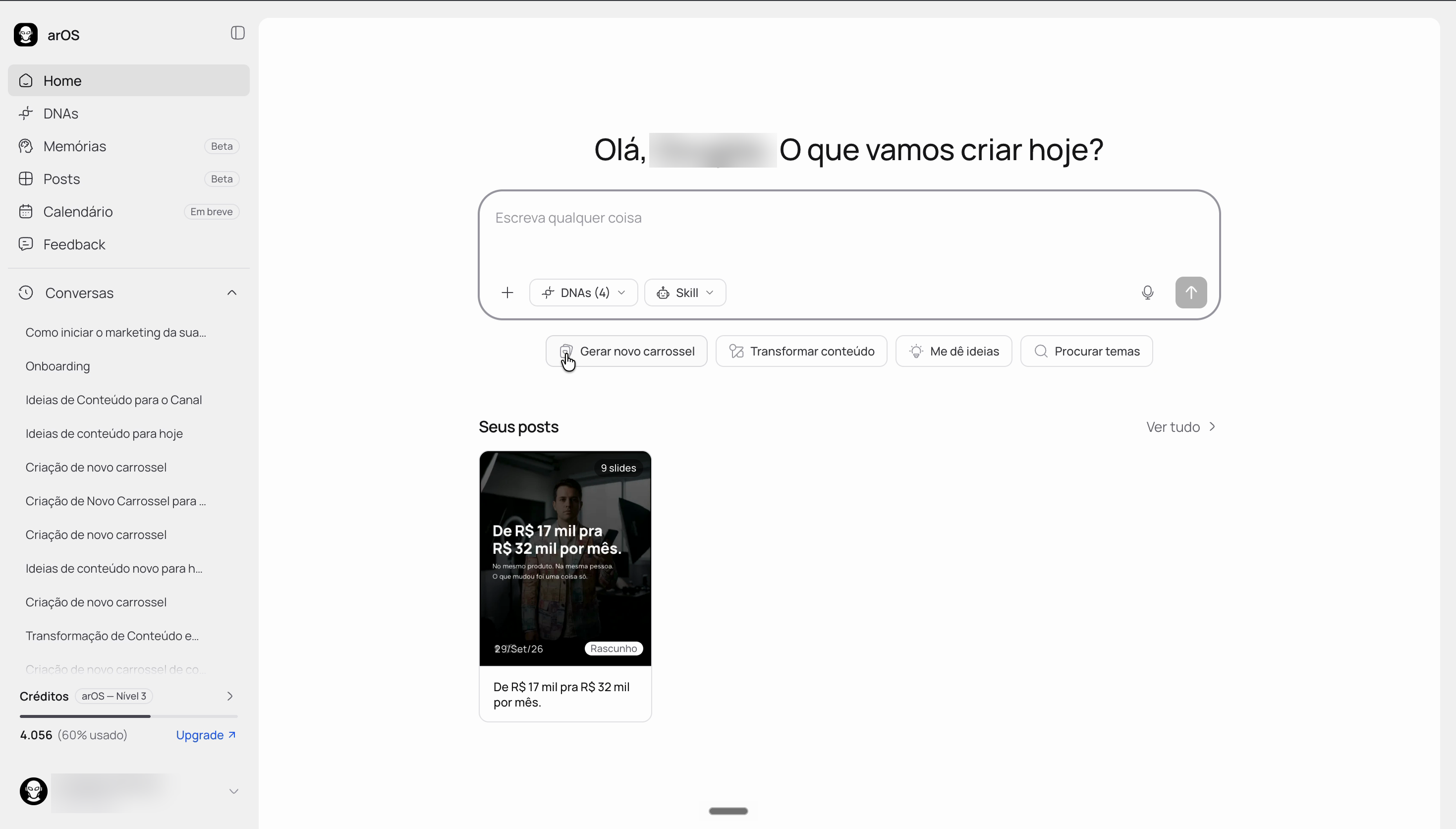
arOS 2.0 · Home
Results
of conversations using business context, after changes to how DNAs are selected and created.
posts generated across arOS during this period.
onboarding drop-off, from April and May to June and July 2026, across three versions of onboarding.
Context and arOS 1.0
arOS helps small businesses and agencies create marketing with AI. Its edge is context: reusable profiles of a business's brand, audience, product, and offer, which arOS calls DNAs. These profiles provide reusable business context for AI-generated responses.
When I joined in June 2025, arOS 1.0 worked agent by agent. You picked a specialist, such as an offer generator or a carousel writer, filled in its fields, and got one output at a time. From June to December 2025, I worked on 1.0 with a team of 6 low-code developers and 2 prompt engineers.
What I shipped in 1.0
- Automatic DNA creation. A guided questionnaire replaced 40 to 60 minutes of manual forms. The agents then generated the profile in 1 to 2 minutes.
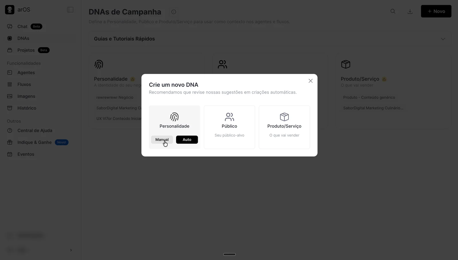
- Combinable DNAs. Three types, personality, audience, and product or service, that mix and match, so a new product or audience no longer meant starting over.
- Projects. Pick and preset several agents on one screen, instead of opening them one at a time.
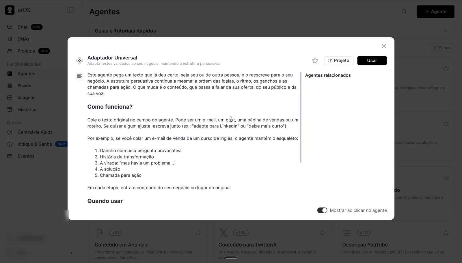
- Agent info. In research, 5 of 10 users couldn't tell what an agent did from its name, and 7 of 10 said their first generation failed because of it. Every agent got a panel explaining when to use it.
1.0 · Agent catalog
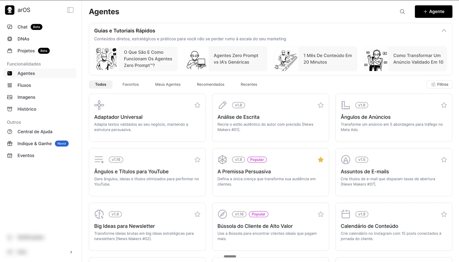
1.0 · Agent info panel
1.0 · Three combinable DNA types
1.0 · Guided DNA questionnaire
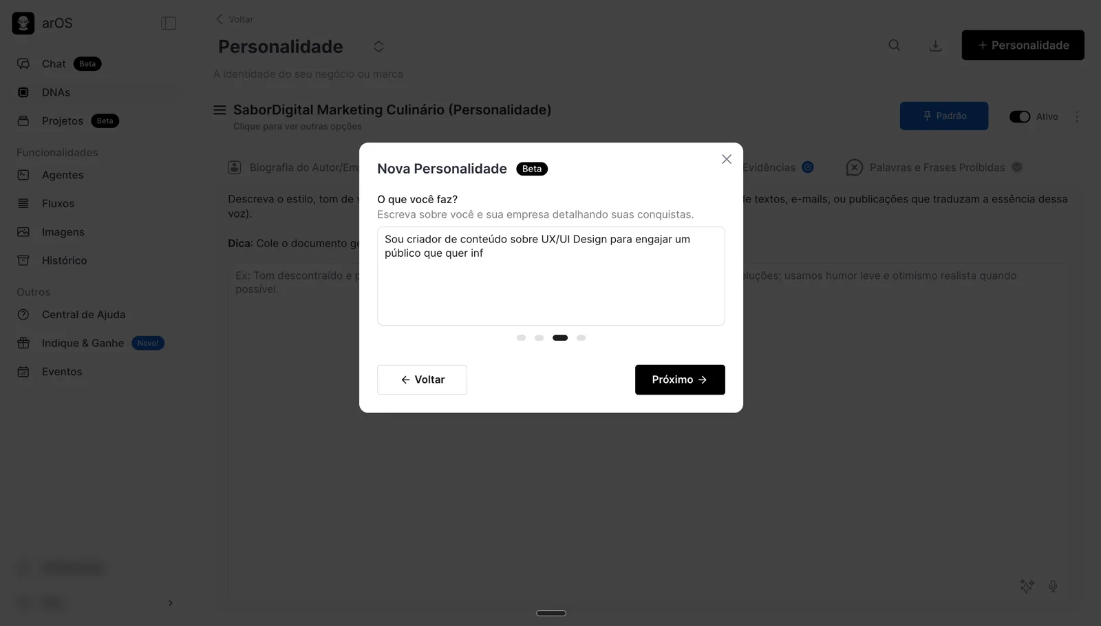
1.0 · DNA generated in 1 to 2 minutes
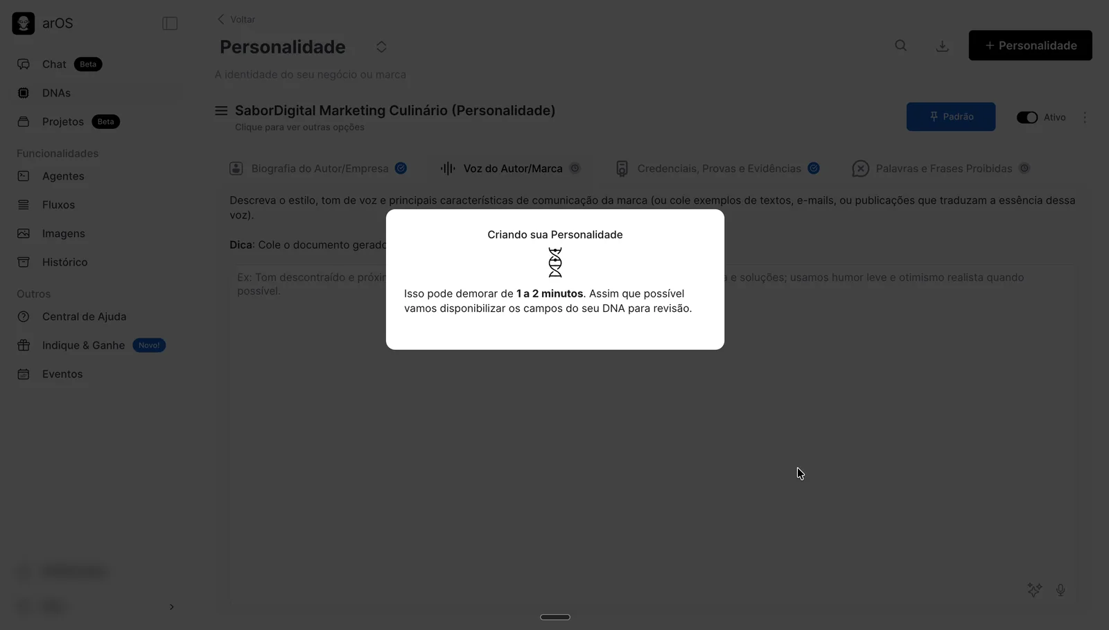
1.0 · Project with several agents
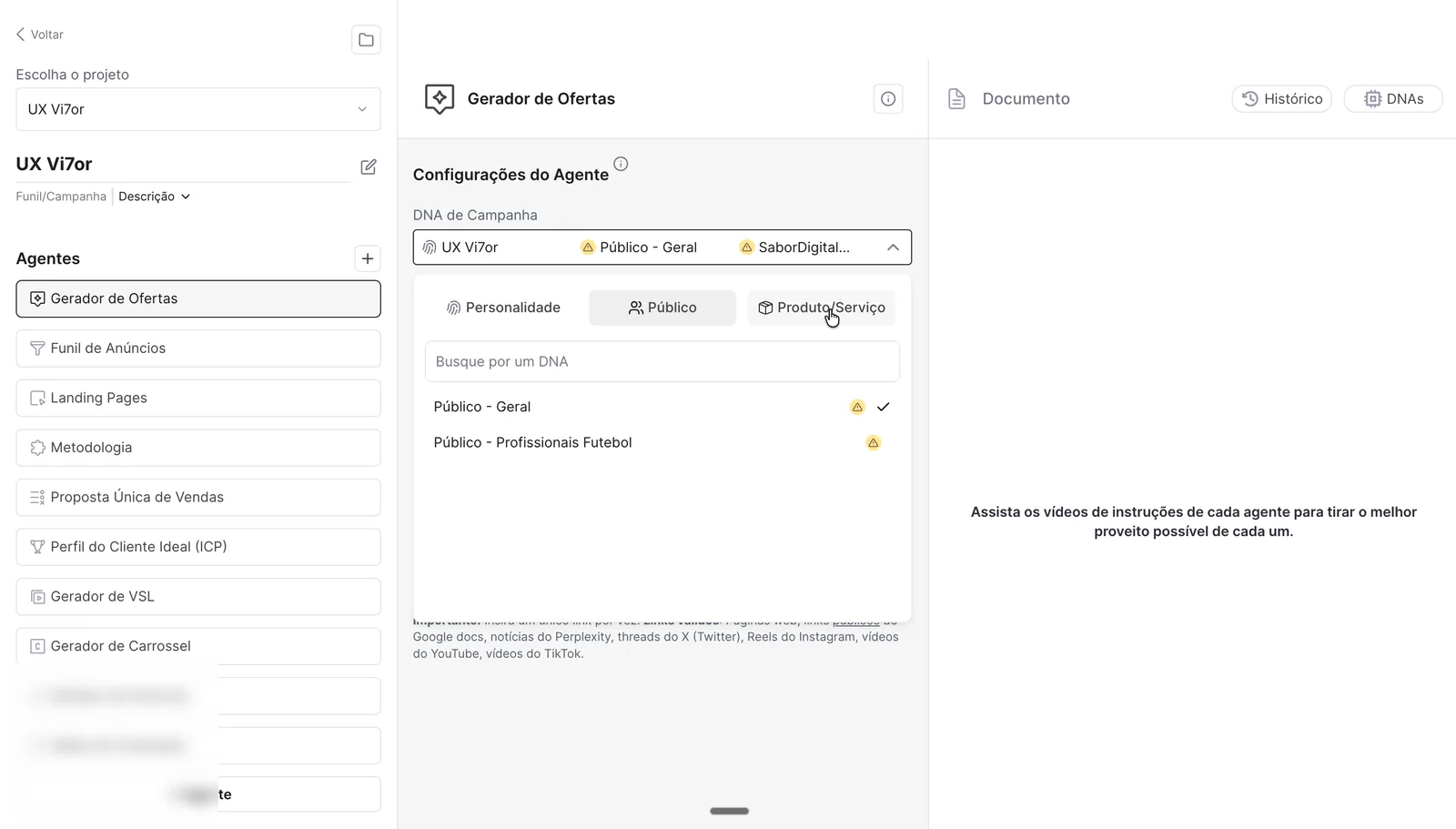
From agents to a conversation
arOS 1.0: agent by agent
- Pick an agent
- Fill in its fields
- Get one output, then start over with the next agent
Context: DNAs of three types, personality, audience, and product or service.
arOS 2.0: one conversation
- Ask anything
- Add business context and, if you want, a skill
- Get answers, carousels, or DNA updates in the same chat
Context: DNAs of four types, brand, audience, product or service, and offer, plus memory across chats.
The problem
Generic AI tools write fast. In our discovery interviews, people described a different bottleneck: refining. They spent their time fixing tone, swapping words they would never use, and reshaping sentences that didn't sound like them, often across several AI tools for a single post.
My PRD put it in one line: AI was speeding up writing, not results.
At the same time, more than 70% of the users we researched wanted to work through chat. For most people, generative AI already meant chat. And with 32K+ registered users on 1.0, the new version had to feel like an upgrade, not a reset.
How we would know it worked
- Time to the first answer the user rates as good, and onboarding activation
- Fewer manual adjustments to answers
- Answer quality scored with LLM-as-a-judge evals
- Retention by cohort, and cost and latency per answer
My role
From January to October 2026, I was the designer and Product Owner of arOS 2.0, working with our Head of Product, 5 developers, and 2 prompt engineers.
- Wrote the 2.0 PRD: a lean first release, decision principles, the split of roles between Product, AI Engineering, and Technology, AI governance in Langfuse, and success metrics.
- Wrote the August 2026 product plan: a diagnosis from production data, a benchmark of 28 companies, audience research, and each initiative tied to a metric for evaluating its success, plus what not to do yet.
- Framed every new initiative with a template based on Shape Up pitches, and wrote the user stories, from simple features to new products and internal platforms for analytics, usage, and access management, with acceptance criteria and design specs tied to the coded design system.
- Structured the research scripts, co-led the interviews, ran usability tests, and reviewed PostHog every week.
- Designed the base UI for chat and DNAs, created and maintained the design system, and prototyped features in React before development, such as visual identity in the DNA.
- Built features myself with an AI-assisted workflow, such as the reply chips, after recordings showed how many messages were just "go ahead", and commands and shortcuts. Small, evidence-backed improvements reached users without taking time from a small engineering team.
Constraints
- 32K+ registered users on 1.0 to bring along.
- Credit-based usage: every message, edit, and generation costs credits.
- A small team, so uncertain bets had to stay cheap.
- Non-deterministic output: answer quality had to be measured, not assumed.
Process
- Assumption mapping
I sorted what we knew, assumed, and doubted in a CSD matrix to decide what to research first.
- A PRD written as a hypothesis, February 2026
A deliberately lean first release. Project folders, manual editing of answers, automatic DNA creation outside onboarding, and continuous web scraping stayed out.
- Interviews and usability tests, February and March 2026
I developed the interview guide, co-led nine discovery interviews, and synthesized the findings in Dovetail. Then 11 participants, all coming from 1.0, used 2.0 from its very first screen in moderated usability tests with a strict protocol.
- After launch: 550+ session recordings
Every week, PostHog events and session recordings fed the backlog. Most of what came after the first release started there.
What we heard in the interviews
Writing was fast. Making it sound like the brand was slow: the tone, words people would never use, sentence shapes that read as machine-made.
Led to: business context in every chat, and editing answers in placeBrand manuals, tone-of-voice guides, and offer docs sat in Notion or NotebookLM and were pasted in again for every task.
Led to: DNAs picked once and remembered across chatsIdeas in one tool, copy in another, images and layout in a third. Every hop meant explaining the business again.
Led to: one chat with skills, and carousels rendered inside itPeople had a few hours a week for content, and planning a sequence of connected posts was still done by hand. Later, a Coming soon calendar drew about 60 users a week before it did anything.
Led to: posts in the product, and a content calendar on the roadmapWatch, don't help
- Don't explain the tool, demo it, correct errors, praise, or defend.
- If someone gets stuck, stay silent. If asked "what is this?", ask back: "What do you think it is?"
Success criteria
- 70% or more generate something usable
- 20% or fewer need explicit guidance
- 60% or more explore at least one feature beyond chat
Value shows up inside the answer
- The chat is the core of the product. No side flows are required to get value.
- Context (DNAs) and behavior (skills) are optional and can change mid-conversation.
- Complexity only gets in when it brings a measurable gain, and nothing gets built before it's validated with users.
What the first 6 test sessions surfaced
- Answer structure and wording4 of 6Fed: editing answers in place
- Uploading files4 of 6
- Editing DNAs4 of 6Fed: managing DNAs from the chat
- Renaming conversations3 of 6Fed: pin and rename instead of folders
- Onboarding video3 of 6
- Links in onboarding2 of 6
- Understanding agents2 of 6
- Confirming the DNA selection2 of 6Fed: context that applies instantly
Key decisions
-
Chosen
Chat becomes the product
- Evidence
- More than 70% of the users we researched wanted to work through chat, and generative AI already meant chat for most people.
- Decision
- One chat where people pick business context and, if they want, a skill. With no skill selected, the default chat still knows marketing.
- Trade-off
- We kept DNAs as the differentiator so 1.0 users' context would carry over, and moved from three types to four: brand, audience, product or service, and offer. Front-end engineering led that restructure. I designed the base UI for chat and DNAs.
-
Discarded
A node canvas for skills
- Idea
- An n8n-style canvas of skill nodes next to the chat, to bring back 1.0's projects.
- Why not
- High build cost for a behavior we weren't confident people would adopt, when they already used AI as plain chat.
-
Discarded
Folders for conversations
- Evidence
- The PRD had left project folders out of the first release. Testing backed it: renaming conversations came up in 3 of 6 sessions, a lighter way people already used to stay organized.
- Decision
- Pin and rename, instead of folders.
-
Chosen
Context that sticks
- Evidence
- All 11 test participants came from 1.0 with a single DNA. In their first conversation, 7 of 11 didn't select the DNA they had just created in onboarding, and 5 of 11 picked one but never clicked “Save”.
- Decision
- Selection applies the moment you pick it, with no “Save” button, plus a “Remember selection” toggle that carries context into new chats.
- Result
- Business context went from about 40% to almost 70% of conversations, together with easier ways to create DNAs.
The picker, with “Remember selection”
-
Chosen
Editing comes back
- Evidence
- The PRD had left manual editing out of the first release. Then 6 of 11 test participants spent a long time reading generated copy only to want a tweak or two, and 4 in 10 users in our earlier research already edited AI copy.
- Decision
- Edit any answer in place, with an “Edited” marker and a switch between the original and your version.
-
Chosen
Suggested replies, planned and shipped by me
- Evidence
- Reviewing 300+ session recordings, I saw that many messages people typed were just permission or a nudge to keep going, like "yes, go ahead."
- Decision
- Up to 4 reply chips under each answer, built from the conversation context and the answer itself. I planned the feature and implemented it myself, with an AI-assisted development workflow.
- Result
- Used by 15.4% of active users.
Reply chips under an answer
The first release
The interviews and usability tests shaped the base of 2.0: onboarding, the chat itself, how people choose skills and get results, and business context through DNAs.
Onboarding, in three versions
Onboarding was the hardest part to get right. It went through three versions, each one driven by where people were dropping off.
1Links, a product tour, and a video
The first version asked for links, then played a short animated tour of the chat, skills, and DNAs, which helped people coming from 1.0 find their way. A 5-minute welcome video followed, with a loading bar underneath showing the DNA being created from the links. When it finished, a button let people into the product.
Onboarding, version 1 · Wireframe
Adicione seus links
Seu site, landing page ou qualquer link que fale de você e do seu negócio.
Tudo acontece no chat
Peça, ajuste e crie em uma conversa só.
Skills e DNAs
Uma skill para cada tarefa, e o contexto do seu negócio em cada resposta.
Boas-vindas à nova arOS
What happened: in April and May 2026, 43% of new users dropped off before creating their first DNA. They arrived through our offers and left while watching and waiting.
2A conversation instead of a video
To keep people doing instead of watching, we removed the tour and the video. After the links, a chat that already knew the business from them built the first DNA together with the user, through a few questions with quick-pick answers.
Onboarding, version 2 · Wireframe
Adicione seus links
Seu site, landing page ou qualquer link que fale de você e do seu negócio.
O que vamos criar hoje?
What happened: across the onboarding redesign, drop-off fell by 27 percentage points, from 43% to 16%.
3Instagram and context, the version shipped today
Once posts and Instagram content became a core job, Instagram joined onboarding: reading the profile helps us understand the business, and its palette, post style, and type feed the brand DNA. The links step also gained a context panel that explains what we need from people and why.
Onboarding today, step 1 of 4: links and context
What happened: by June and July, drop-off was down to 16%, from 43%, and activation had risen from about 60% to close to 75%.
With engineering: in a technical refinement session I initiated, we defined conversational onboarding as a hidden admin skill that tracks completion, counted once a person creates at least one brand or audience DNA, with an orchestrator calling one skill per DNA field.
Skills, easier to find
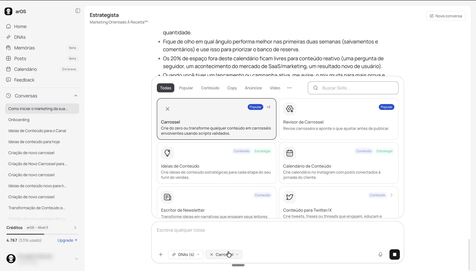
The first skill picker was narrow, with search on top and one long list. Skills with options expanded inside the list and stretched the popover. It hid what we had built: of about 100 skills, a long tail of around 75 averaged 3.4 selections a month each.
What changed, and why:
- Tabs by category, to help users scan skills more quickly by category.
- A grid instead of a list, showing more skills at once.
- Tags on each card, showing which areas a skill touches, such as content, strategy, ads, or copy, the same areas as the tabs.
- Search on the right, to give the tabs room.
- Options that open in place, without resizing the popover.
- The first option preselected, so a required option is never forgotten.
- Remove from the chip: a selected skill comes off right from the composer, without opening the picker.
Skill picker, shipped version
With engineering: prompt engineers built each skill. I decided how skills and their options show up in the interface, working with them on what each skill's prompt structure needed so people get the best experience inside it.
After launch
After the first release, PostHog and the 550+ session recordings I analyzed shaped a second wave. We hadn't nailed our ideal customer yet, so we got closer to SaaS founders and saw their need to build credibility on Instagram. Most of what follows came from that.
What usage showed, July and August 2026
of users came back every week, but only 9–18% came back to create.
of people who downloaded posts produced them on a single day of the month.
comments, roughly, called the output generic or "AI-looking", or said it ignored the briefing.
People liked coming back, but creating was an event, not a routine, and generic output was a frequent complaint. That set the agenda for what follows.
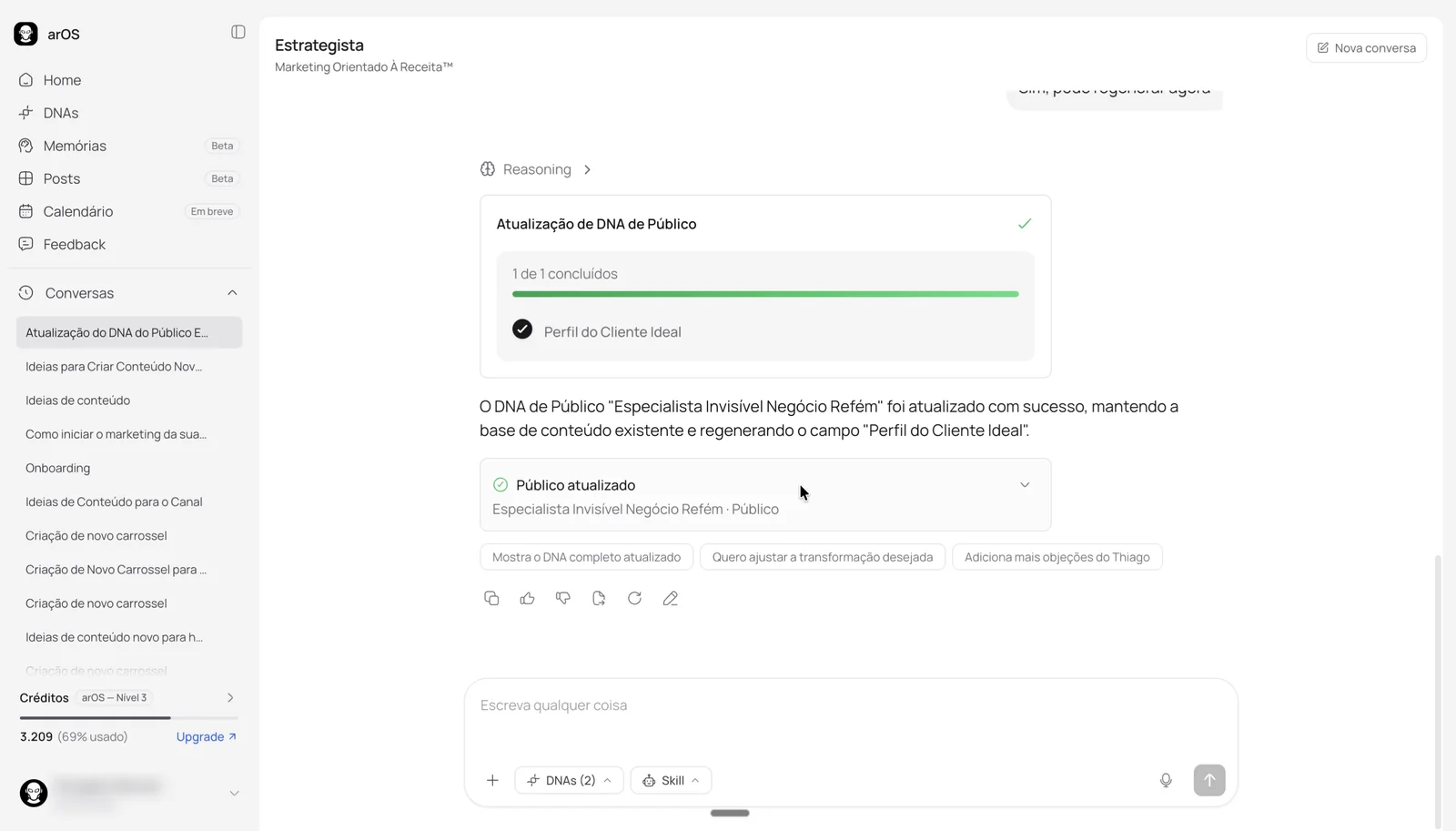
DNAs managed from the chat
Creating and updating DNAs without leaving the chat was a request since 2.0 launched. arOS infers the change from the conversation, shows its progress field by field, and links the result. It uses credits like any other message.
An audience DNA rewritten from the chat
With engineering: the DNA manager was built with the technology and AI engineering teams. I defined how it behaves in the interface: a task card that shows each field as a step, a result card that links to the updated DNA, and the same credit cost as any message.
Posts, carousels, and Instagram
Posts and carousels weren't in the first release. They came when SaaS founders became our focus: carousels generated in the chat, an editor that takes both chat instructions and manual edits, Instagram connection and analysis, and publishing to Instagram, approved by Meta.
From approved copy to a visual carousel
Editing every slide with one instruction
With engineering: in prompt reviews, I set that during beta the carousel skill always renders the visual carousel instead of sometimes returning text only, and that carousels can be edited both by hand and from the chat.
Visual identity in the brand DNA
DNAs were organized in tabs, brand, audience, product or service, and offer, and every one was a text field. There was no good way to define the look of a post. People complained that posts didn't match their brand and spent a long time fixing them. Some gave up on the platform, others kept only the copy.
I watched the recordings, saw the frustration, and measured edits and regenerations: 13,722 cover regenerations in a single month. The post creator needed to talk to the user's DNA. Visual identity became a new section in the brand DNA, with post style, colors, type, ready-made templates, and a live preview. People can connect a different Instagram account at any time, and its palette, post style, and typography update the visual identity, so posts stay close to the brand they already have. During this period, arOS generated 20 posts per day.
Editing the visual identity, then a tab still made of text fields
Memory and attachments
The recordings showed people referencing other conversations, pasting screenshots of past chats, and trying to bring in documents. Memories let them save something once and have it apply to every chat, with a page to manage them: when the chat suggests a memory, 70% get accepted (36 of 51). Attachments followed, kept simple, and brought images into the chat, another frequent request.
The chat suggests a memory
An image attached to use in a carousel
Skills that find the user
Only 57% of users chose a skill when chatting. People liked the product but missed most of what it could do for them. So skills started finding the user: automatic skill inference picks the right one from the conversation, and commands and shortcuts, which I planned and implemented, let people call a skill the way they already did in other AI tools.
Mobile web and PWA
About 70% of visits came from phones, 7,046 against 2,988 on desktop, and cancellation feedback singled out the mobile experience. I redesigned the experience for small screens around one idea: the main actions within thumb reach. We shipped it as a PWA.
Bottom sheets and the keyboard
Pickers became bottom sheets
Popovers are hard to use on small screens. On mobile, DNAs, skills, and their options open as bottom sheets, close to the thumb. Skills with options get their own space, so it's clear there's a choice to make, and the first option comes preselected.
The keyboard only when typing
The keyboard took so much of the screen that the composer covered the content. It now opens only when the text area is tapped and closes as soon as the user touches anything else.
Voice instead of typing
Voice input skips the keyboard altogether, and people found it on their own: 55 users dictated messages in 30 days, unprompted.
One thing at a time
In the post editor, people see one thing at a time. Opening the chat hides everything else until the edits are applied, and the same goes for each manual tool. A bottom sheet lists what can be edited, and every change shows its result on the selected slide.
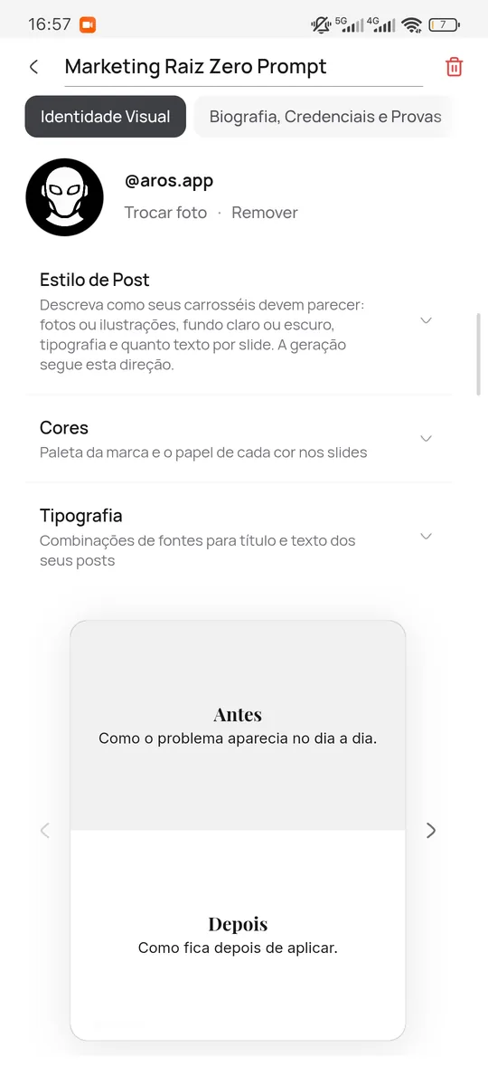
Everything, in one column
Visual identity was reorganized vertically, so everything it offers on desktop is there on a phone: post style, colors, type, and the live preview.
Installed from the browser
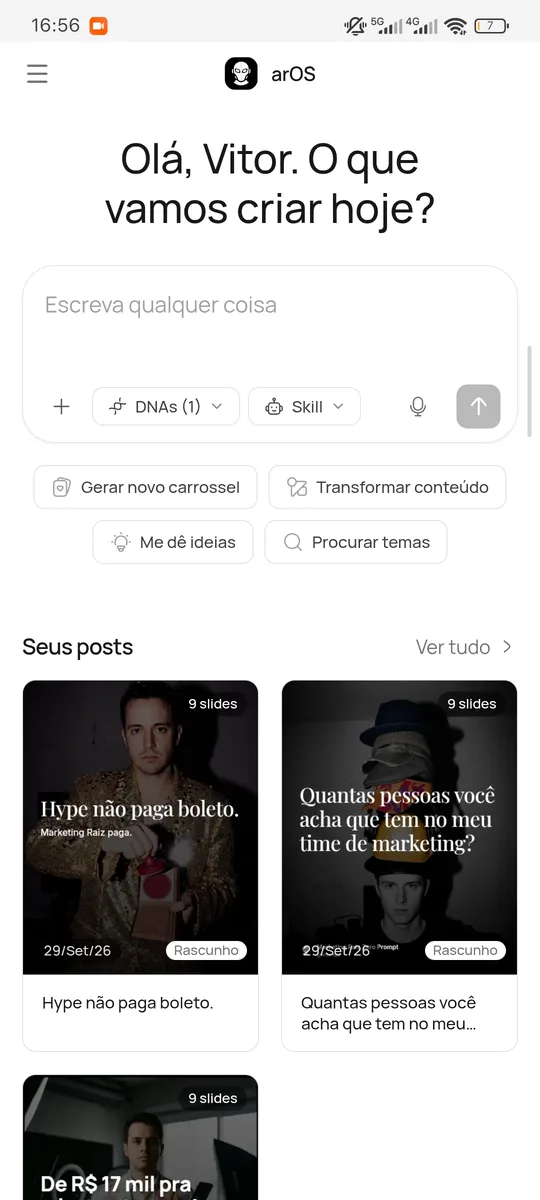
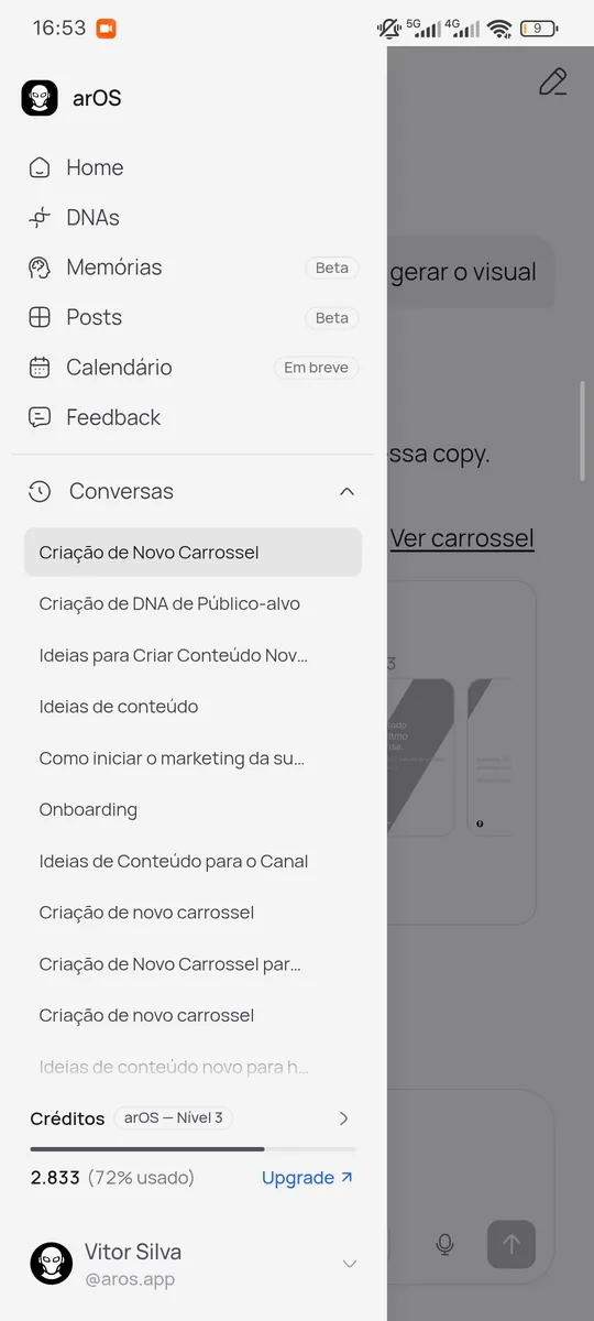
As a PWA, arOS installs straight from the browser, without an app store, and gets a shortcut on the home screen, one tap away like any other app.
What came next
In August 2026, I turned this diagnosis into the product plan. It set the next bets:
- Production as a routine. With 80% of people producing on a single day of the month, the next step was a whole week of posts in one batch, copy first and visuals after approval.
- Closing the loop. Publishing to Instagram and LinkedIn, so results come back into the product.
Design system
I created and maintained the arOS design system: tokens in Tokens Studio, with a base set and semantic sets for light and dark, mirrored in code. When code became our single source of truth, it lived in Storybook, built on Tailwind and Radix.
Colors
Base color ramps feed semantic roles. Components use those roles rather than raw color values, allowing the same components to adapt to light and dark themes.
Semantic roles
Surfaces
Actions
Neutrals and borders
Status and brand
Manrope, one family for everything
Close to Inter, with the same easy reading, especially in light mode, our default. Bold headings, interface text at 14 and 16, nothing below 10.
Shape, depth, and rhythm
Corner radii from 6 to 28 px, cool and subtle shadows, and a 4 px grid.
Components
Built on shadcn and Radix with the same tokens. Try them: everything here is clickable, in light and dark.
Buttons
Badges
Form
Tabs and menu
Dialog
This can't be undone. The project and all its files will be removed.
Composer
Learnings
Chat gave people freedom, but answers only got good when business context came along. Changing how DNAs are selected and created took context from about 40% to almost 70% of conversations, and DNAs became the backbone of every later feature.
A tour, a video, and a loading bar lost 43% of new users. A conversation that builds the DNA with them, then Instagram and clear context, brought drop-off down to 16%.
Only 57% of users chose a skill, and a long tail of about 75 skills averaged 3.4 selections a month. That led to tabs, a grid with tags, commands and shortcuts, and automatic skill inference.
550+ session recordings revealed messages that were just "go ahead", references to past chats, and screenshots pasted from other tools. Each pattern became a feature: reply chips, memories, and attachments.
An easy-to-miss “Save” button was quietly stripping context from most first conversations. Applying the selection instantly, and remembering it, fixed it.
13,722 cover regenerations in a month came from a generator that knew nothing about the brand. Visual identity in the DNA, fed by Instagram and templates, replaced describing a style in text.
Focusing on SaaS founders who wanted to build credibility on Instagram shifted arOS from a copywriting tool toward a broader content workflow. During this period, the platform generated 20 posts per day.
With about 70% of visits on phones, the mobile experience and an installable PWA stopped being nice to have.
Next case: MZiQ, everything IR needs in one place.
Read the MZiQ case